Data-Driven Styling
Customize your map's appearance based on your data
When it comes to advanced map styling, it’s often useful to have styles that adapt to the data itself. With GEOS BI, you can easily achieve this level of customization.
Adjusting Size Based on Data
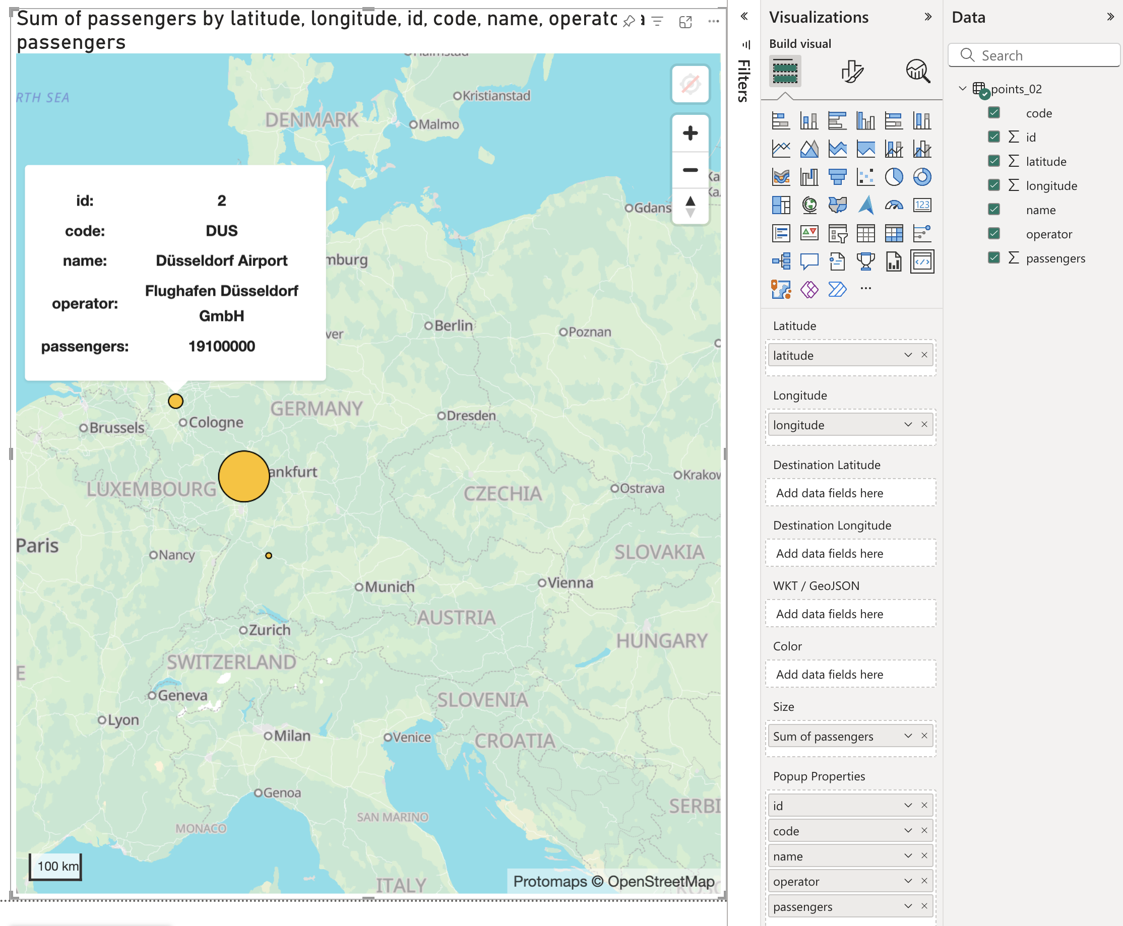
Let’s start with an example using the following dataset:
| id | name | code | operator | passengers | latitude | longitude |
|---|---|---|---|---|---|---|
| 1 | Frankfurt Airport | FRA | Fraport AG | 61600000 | 50.0379 | 8.5621 |
| 2 | Düsseldorf Airport | DUS | Flughafen Düsseldorf GmbH | 19100000 | 51.2894 | 6.7666 |
| 3 | Stuttgart Airport | STR | Flughafen Stuttgart GmbH | 9100000 | 48.6858 | 9.2074 |
You can download the dataset here: points_02.csv
To visualize this data, put the passengers column into the size field in your visual. This will automatically adjust the size of each circle based on the number of passengers:
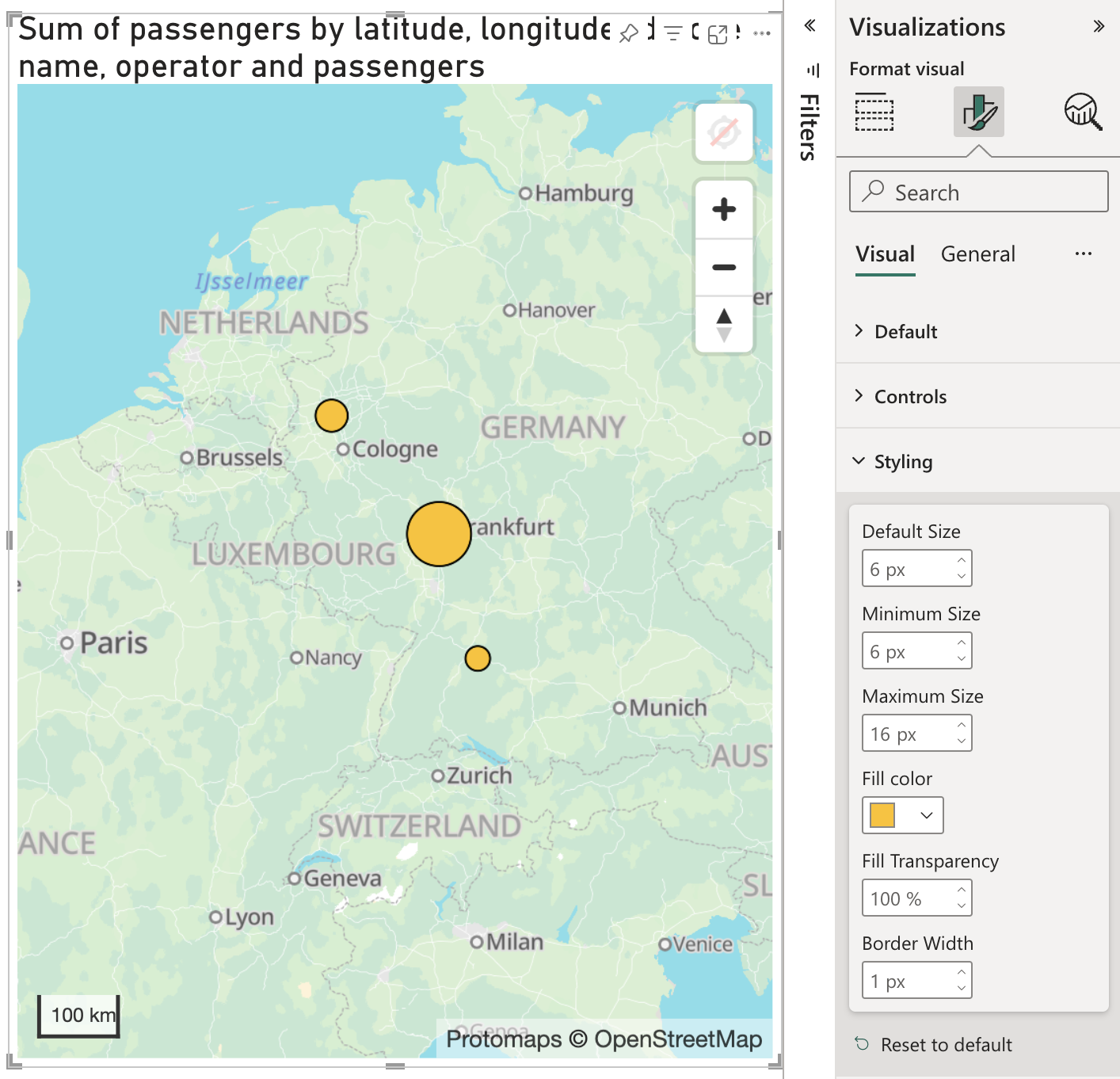
If the size differences between circles are too extreme, you can fine-tune the visual by adjusting the minimum and maximum size values in the format settings:
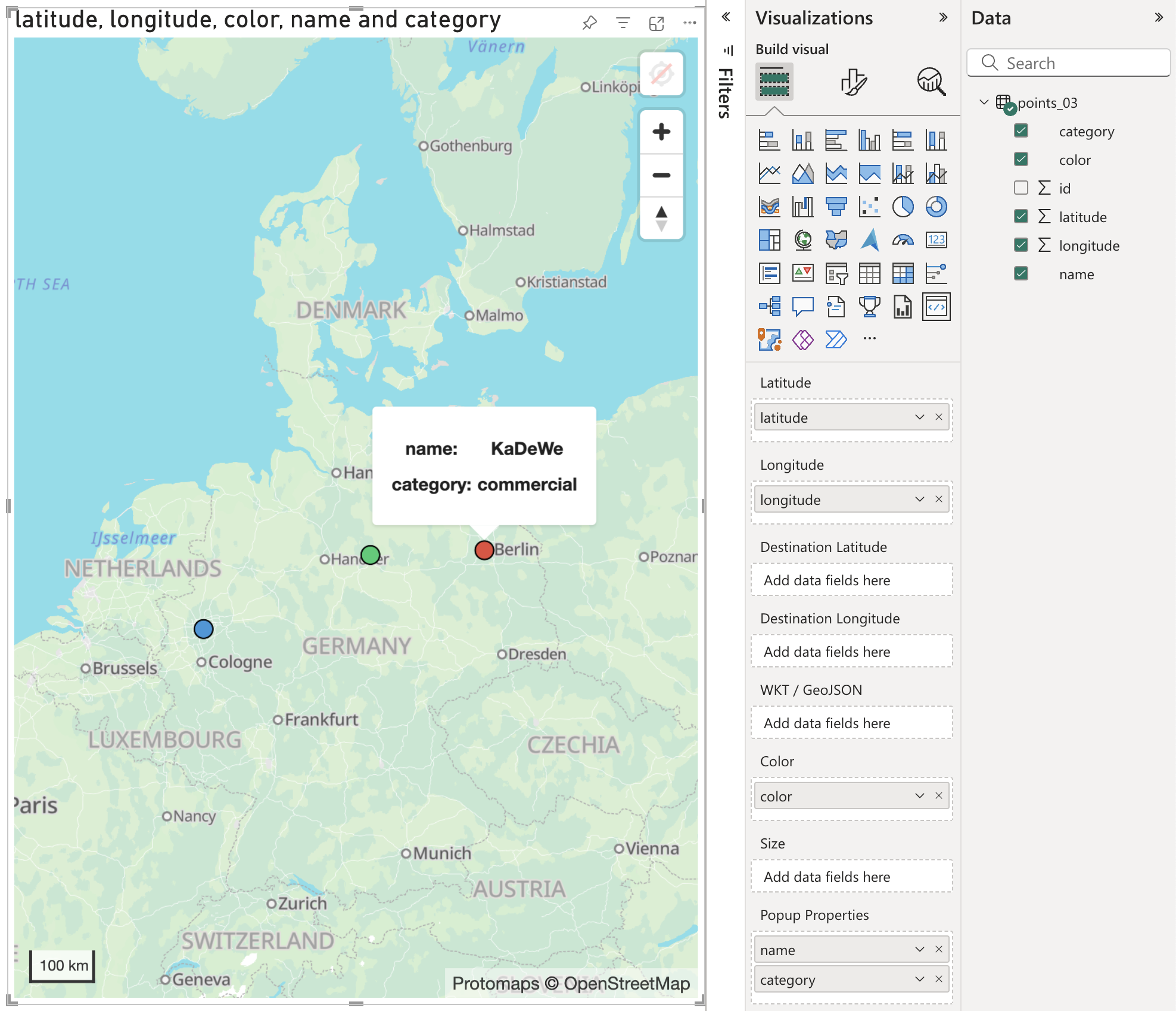
Customizing Colors Based on Data
Next, let’s look at an example using color to differentiate data points. Here’s the dataset we’ll use:
| id | name | category | color | latitude | longitude |
|---|---|---|---|---|---|
| 1 | KaDeWe | Commercial | #E74C3C | 52.5016 | 13.3410 |
| 2 | Villa Hügel | Residential | #3498DB | 51.4068 | 7.0089 |
| 3 | Volkswagenwerk Wolfsburg | Industrial | #2ECC71 | 52.4357 | 10.7695 |
Download the dataset here: points_03.csv
To apply color-based styling, put the color column into the color field in your visual. This will automatically assign the corresponding color to each data point: